
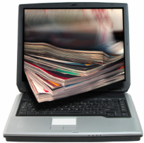
Designing for the web is very different from designing for print, which is something that we don't tend to take into account when scanning through an easy-to-navigate site, but which is more apparent when viewing a headache-inducing mess like angelfire, the 'world's worst webpage'. Unlike any other era, many documents today will be designed for on-screen distribution only and will never be 'printed' in the traditional, commercial sense of the word. The only way many documents will make it onto paper is through as low-quality, desktop ink-jet printer, which largely influences many aspects of design.
According to Roger Parker, graphic designer and author of Looking good in print (2003), website distribution brings up several readability issues but basic rules that enhance printed documents are still applicable. Parker urges his readers to design for the worst case scenario--onscreen reading-- and lists three key differences between designing for print and online:
- Online reading is harder than reading from paper as the screen involves projected light and increases eye fatigue when compared to the contrast range of printed documents.
- A limited amount of text is visible at a time on screen, so readers are more likely to scan as it's harder for them to get a 'big picture' view of what they're reading. Seeing text in a continuous, scrollable flow onscreen can get overwhelming when compared to a printed document that gets tackled one page at a time
- You can never be sure which publication will be read on screen and which will be printed before reading so it's always best to create pages that can be comfortably read either way.
When designing for print there is much less emphasis on getting the audience to actually read the document, so key print design principles are usually more catered toward specific forms (brochures, newsletters, flyers, magazine articles, etc).In conclusion, oscreen reading is becoming more and more accepted, not only with the popularity of the web but also with the push for a more environmentally friendly way of reading. With some practice onscreen design can appear very pleasing and easy to read, but for some forms print will always be the original and the best.
Parker, R 2003, 'Designing documents for web distribution', Looking good in print, Paraglyph Press, Scottsdale, Ariz.
Image source
No comments:
Post a Comment